Project Overview
Details
Role: UI/UX designer
My team: Yi Huan Yang, Sreeja Satish and Emma Houghton
Duration: Fall 2025
Tool and Technologies: Figma, User Research, Affinity Mapping, NUF Framework, User Journey Map
Challenge
Our Goal
Design an efficient and intuitive app
Reflect Pete's consistent reliability, friendly service, and commitment to quality
Cater to the fast-paced needs of on-the-go consumers
Design Process
Empathize
To kickstart the project, we initiated a Fly on the Wall exercise, where each team member observed customers interacting with the food truck at different times of the day. In addition, we conducted interviews with Pete's customers to gain deeper insights into their needs and pain points.
During our User Research Interviews, we also conducted competitive research on existing food truck apps in the market. Additionally, we took an in-depth look at the mobile food ordering process to find inspiration and examples of intuitive and streamlined workflows. Below is our funtional audit from existing apps that we did research on:
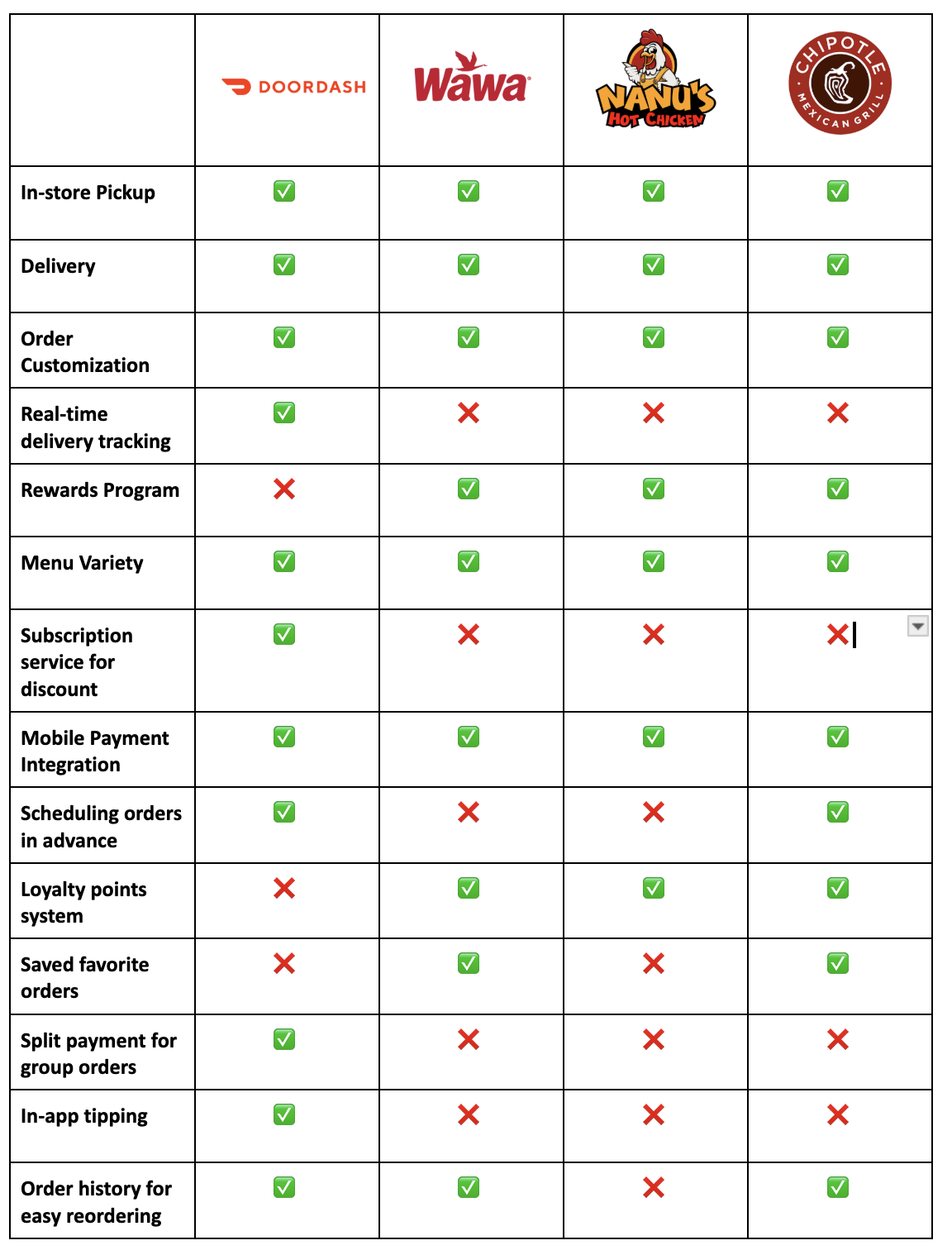
Competitive Analysis
Three ideas that stood out to us are menu variety, order customization, and rewards program. We wanted our app to showcase Pete's extensive menu selection while allowing users to personalize their orders easily. Additionally, we aimed to incorporate a rewards program to enhance customer loyalty and engagement.
Define Phase
After getting enough insights from the customers and competitors, we define 4 user personas which represent each type of the customer and their journey.
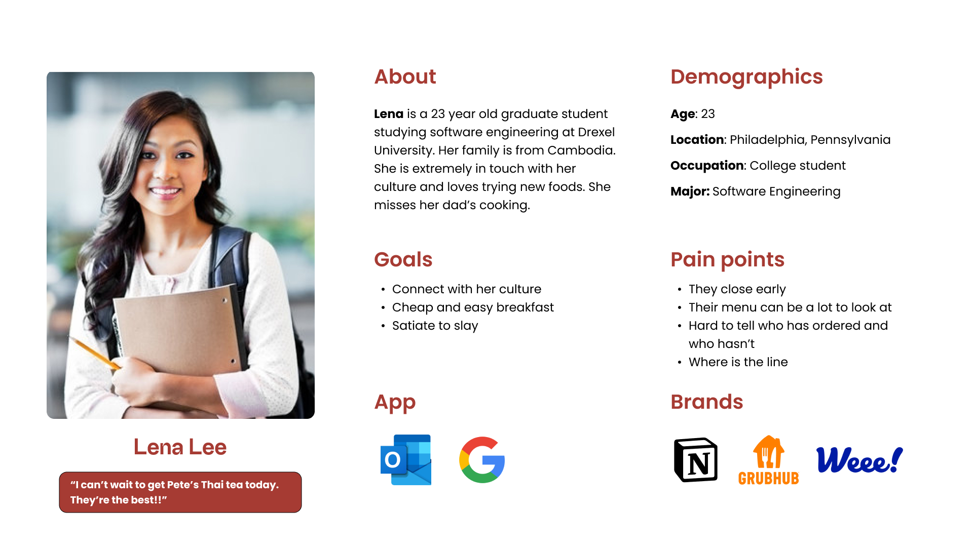
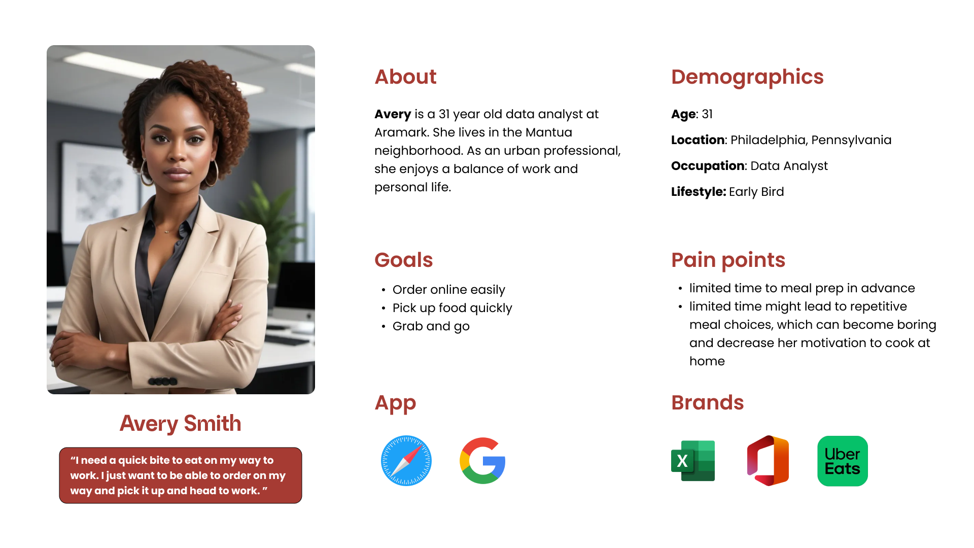
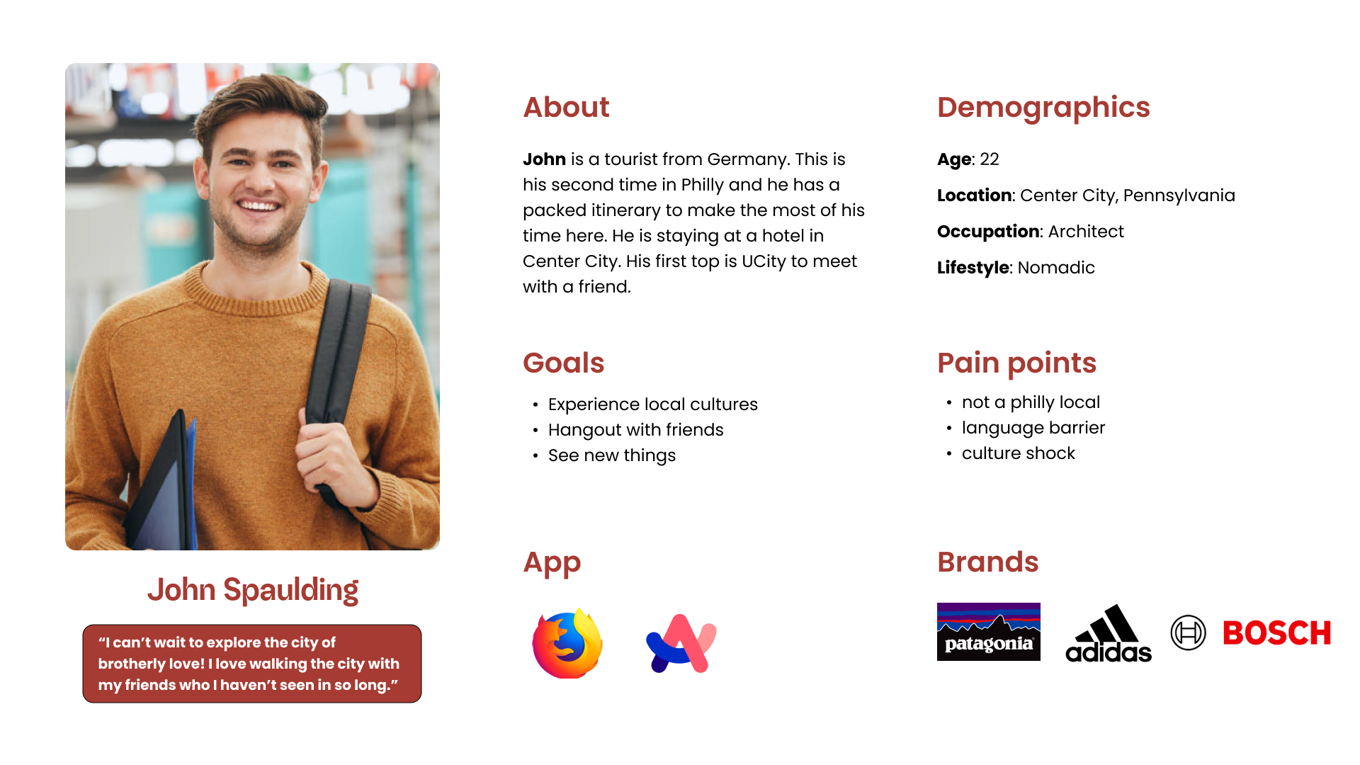
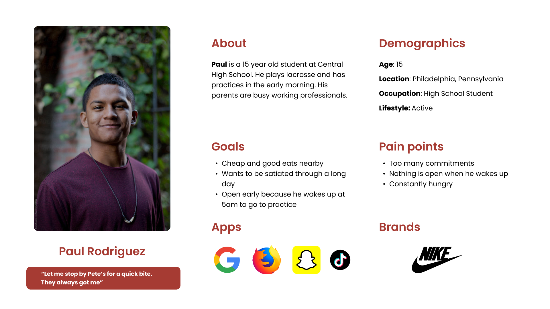
Our primary users included students from Drexel and Penn, along with local professors, faculty, and workers seeking a quick and convenient meal. These groups were identified as the most likely to consistently use the app. Additionally, we considered tourists and visiting families as part of our customer base, though their usage of the app would likely be less frequent.
Form there, we developed a visual representation of the user's journey across all the touchpoints of our application to understand where we can improve the user experience.
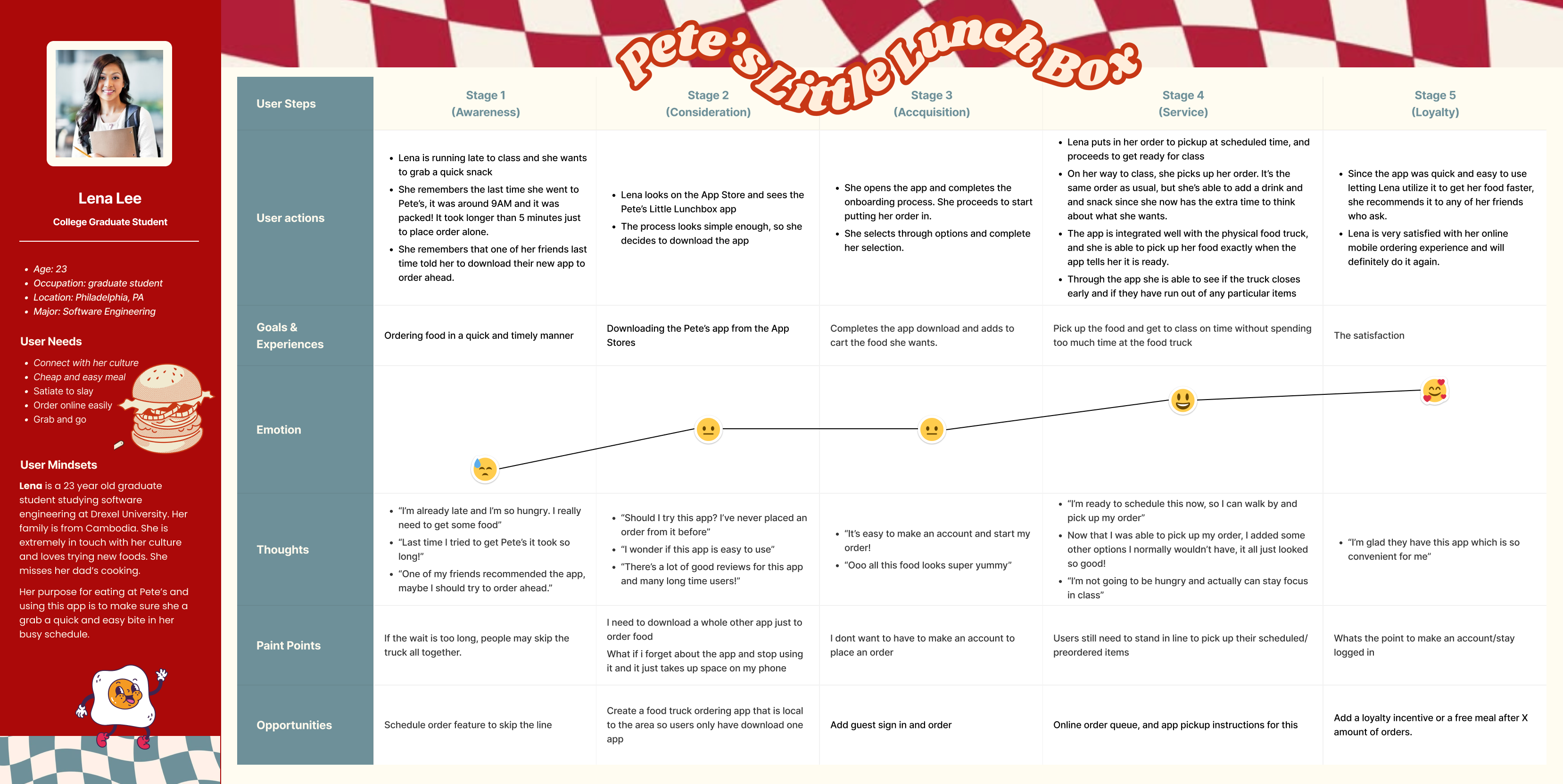
Click on image to view full size
Ideate Phase
In this phase, we conducted card sorting and performed a NUF (New, Useful, and Feasible) analysis, evaluating features on a 7-point scale to prioritize and refine our design decisions.
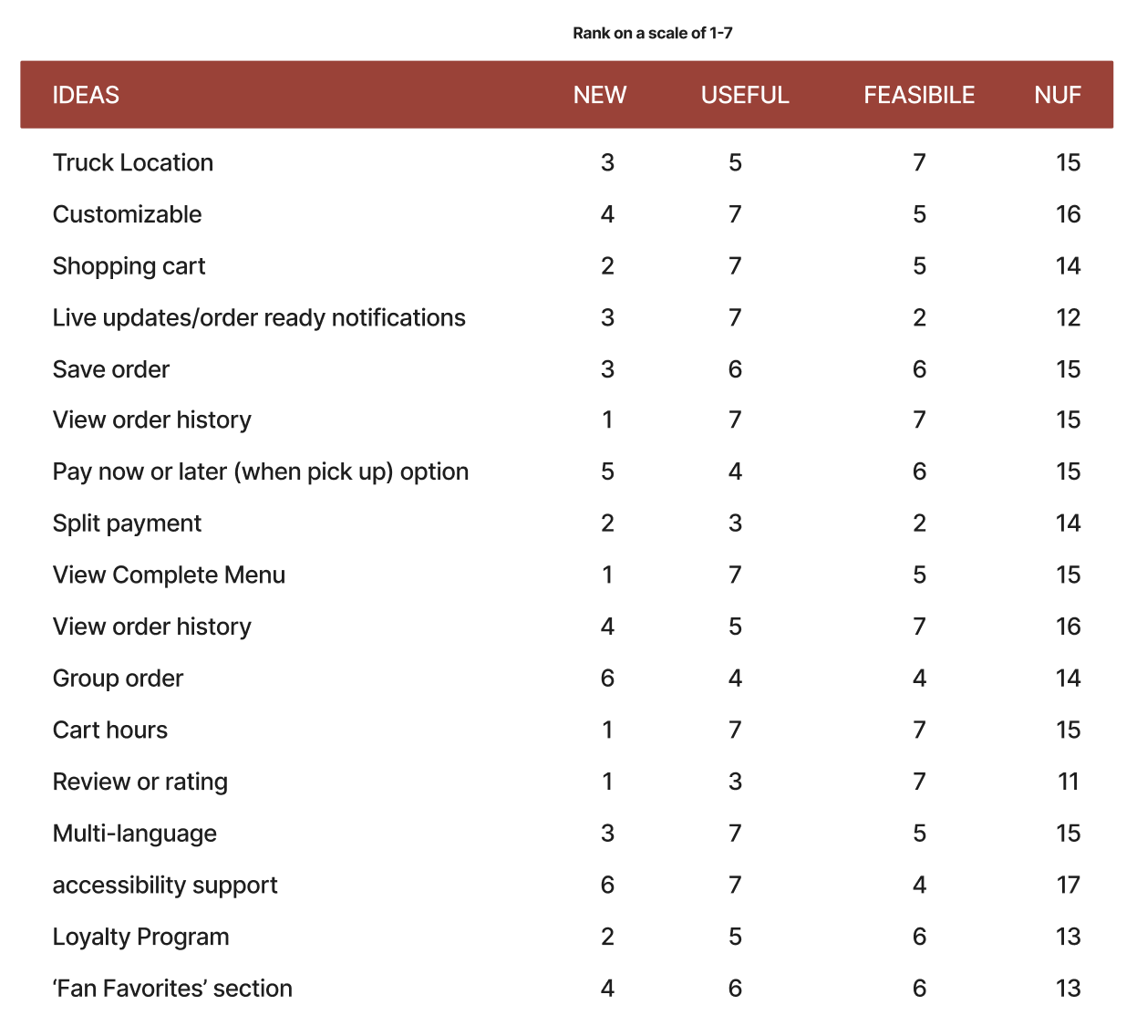
NUF Analysis
After brainstorming and identifying all the potential features for our app, we moved on to sketching and user flow. Each team member contributed unique ideas, and we selected the best elements from each concept to create a cohesive wireframe and paper prototype.
For the moodboard, each team member created a unique version, and we combined elements from all of them to design a unified moodboard. Our goal was to evoke a comforting feel through the color palette while retaining the red from Pete's original branding. We also incorporated a lunchbox icon and other signature elements to stay true to Pete's established brand identity.
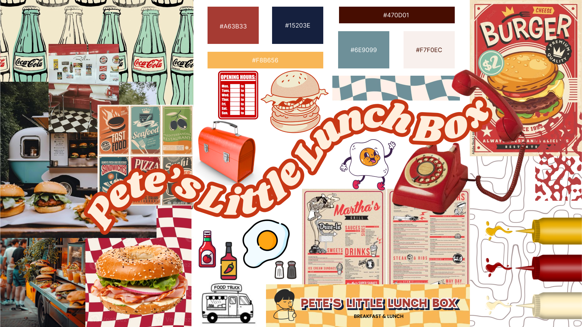
Our final moodboard
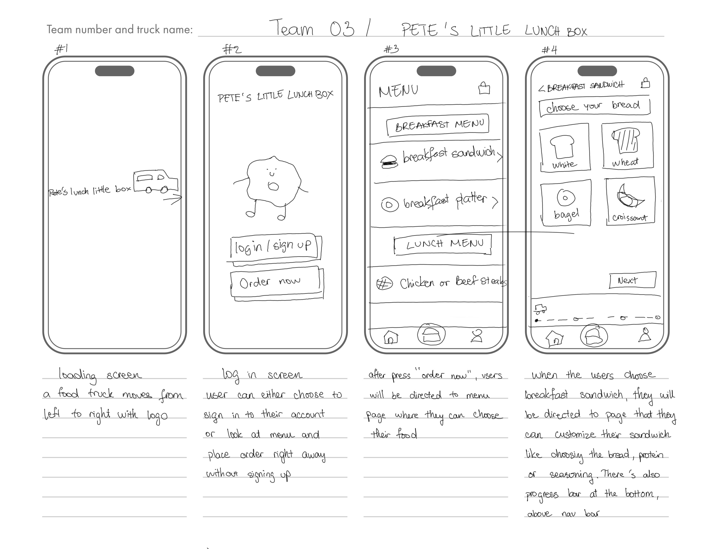
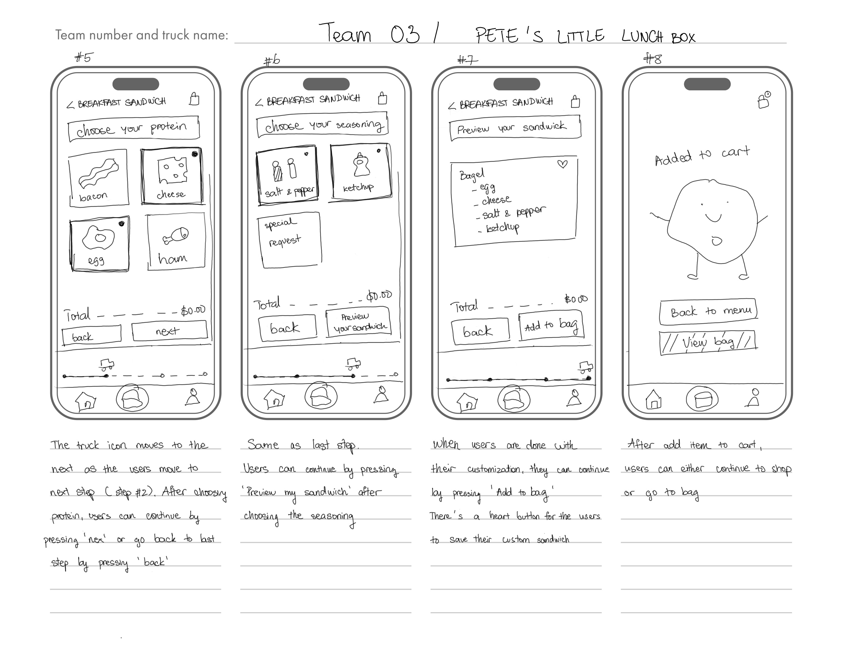
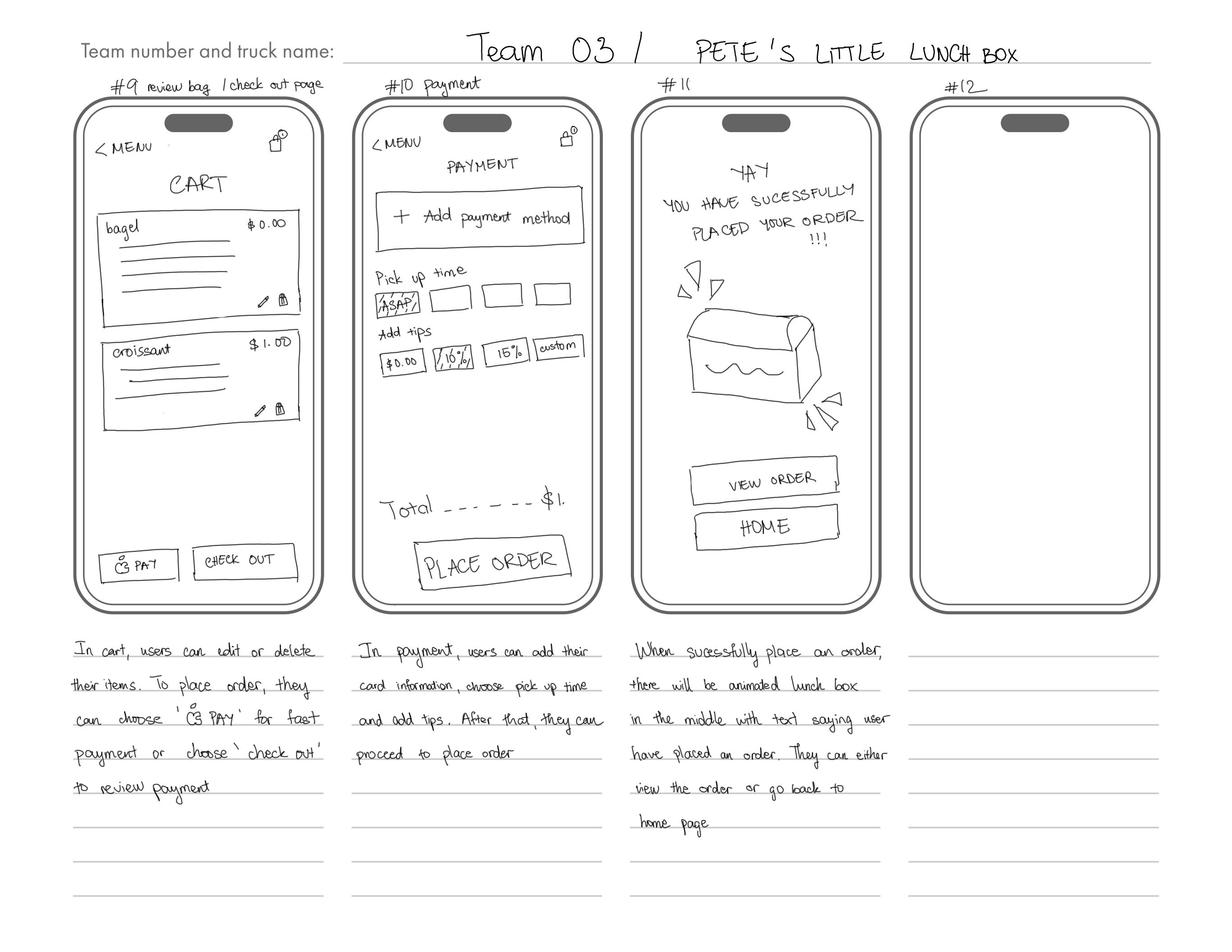
After combining and selecting the user tasks we wanted to prioritize, we proceeded to create a paper prototype, which we used for our first round of testing.
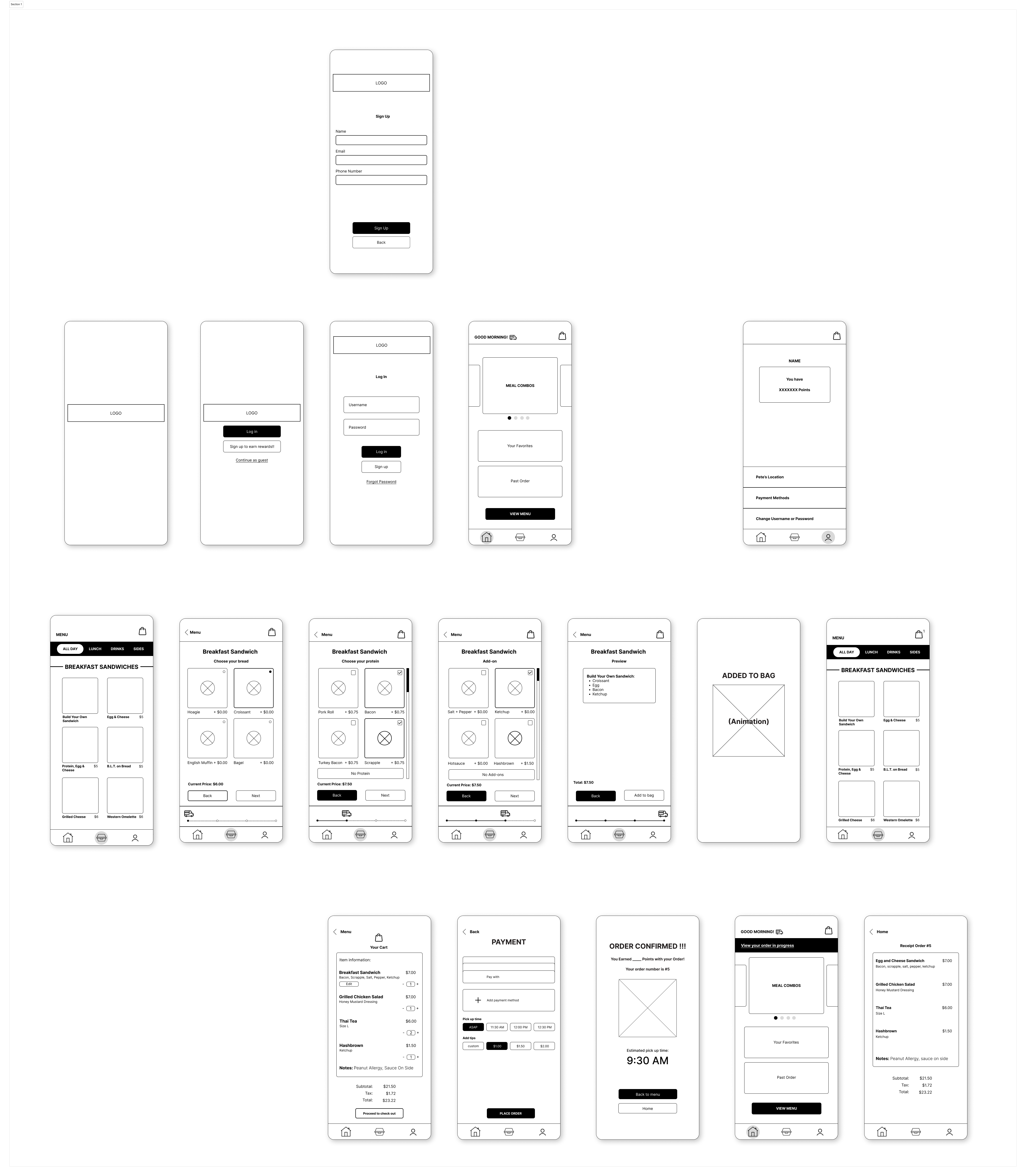
Paper prototype/wireframe
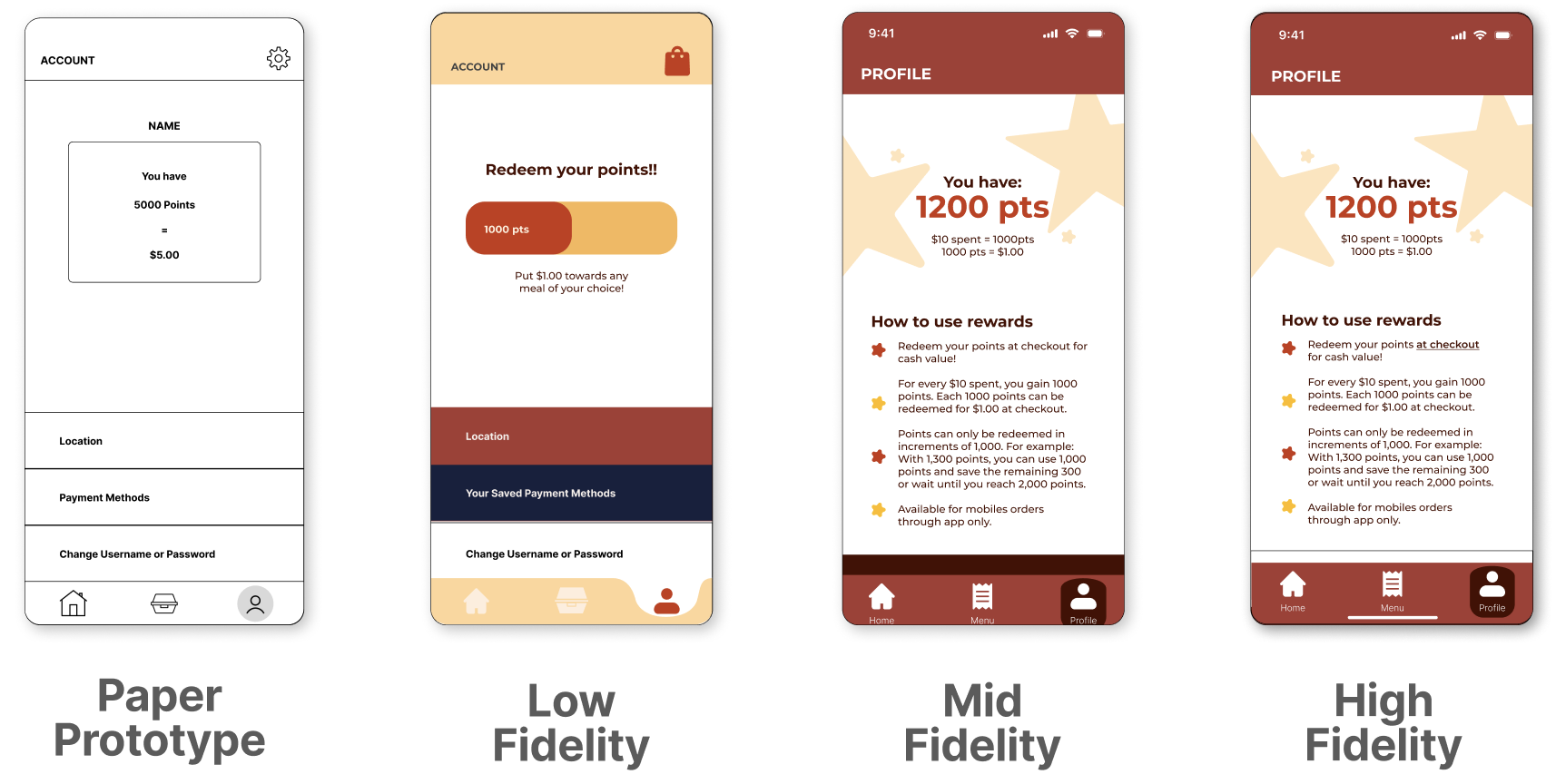
Test Phase
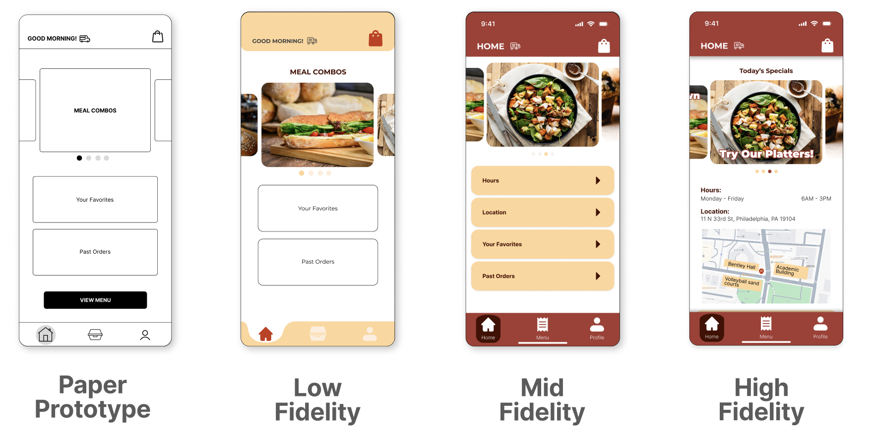
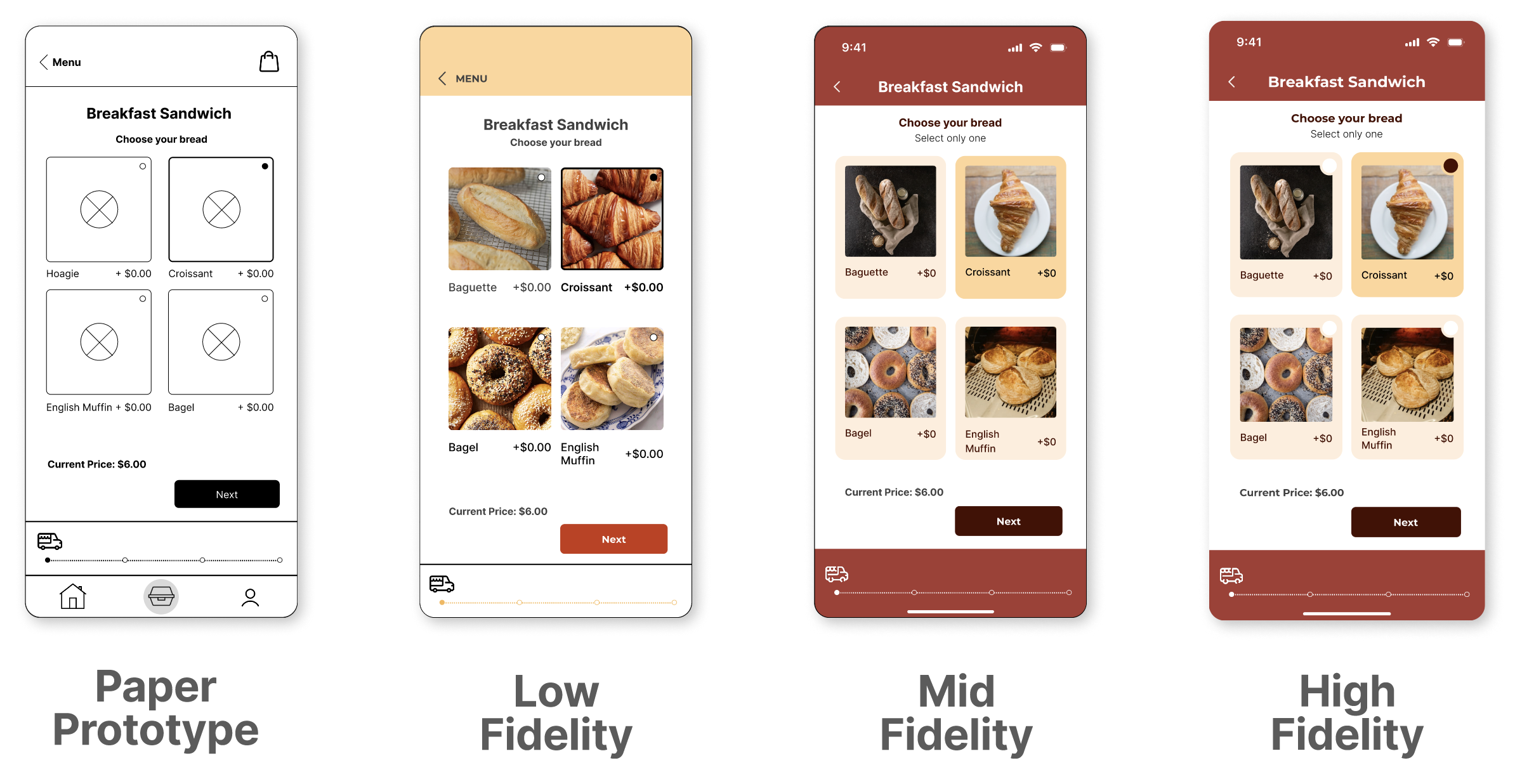
Below is the evolution of our prototype, showcasing multiple iterations that incorporate feedback gathered from users during several rounds of testing. Each iteration reflects improvements made to enhance usability, address pain points, and align the design more closely with user needs.
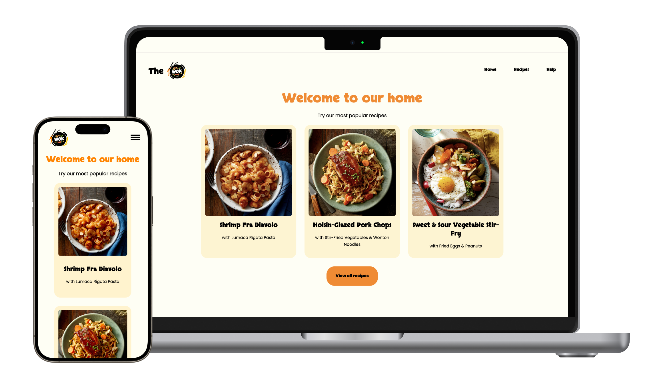
Home Screen
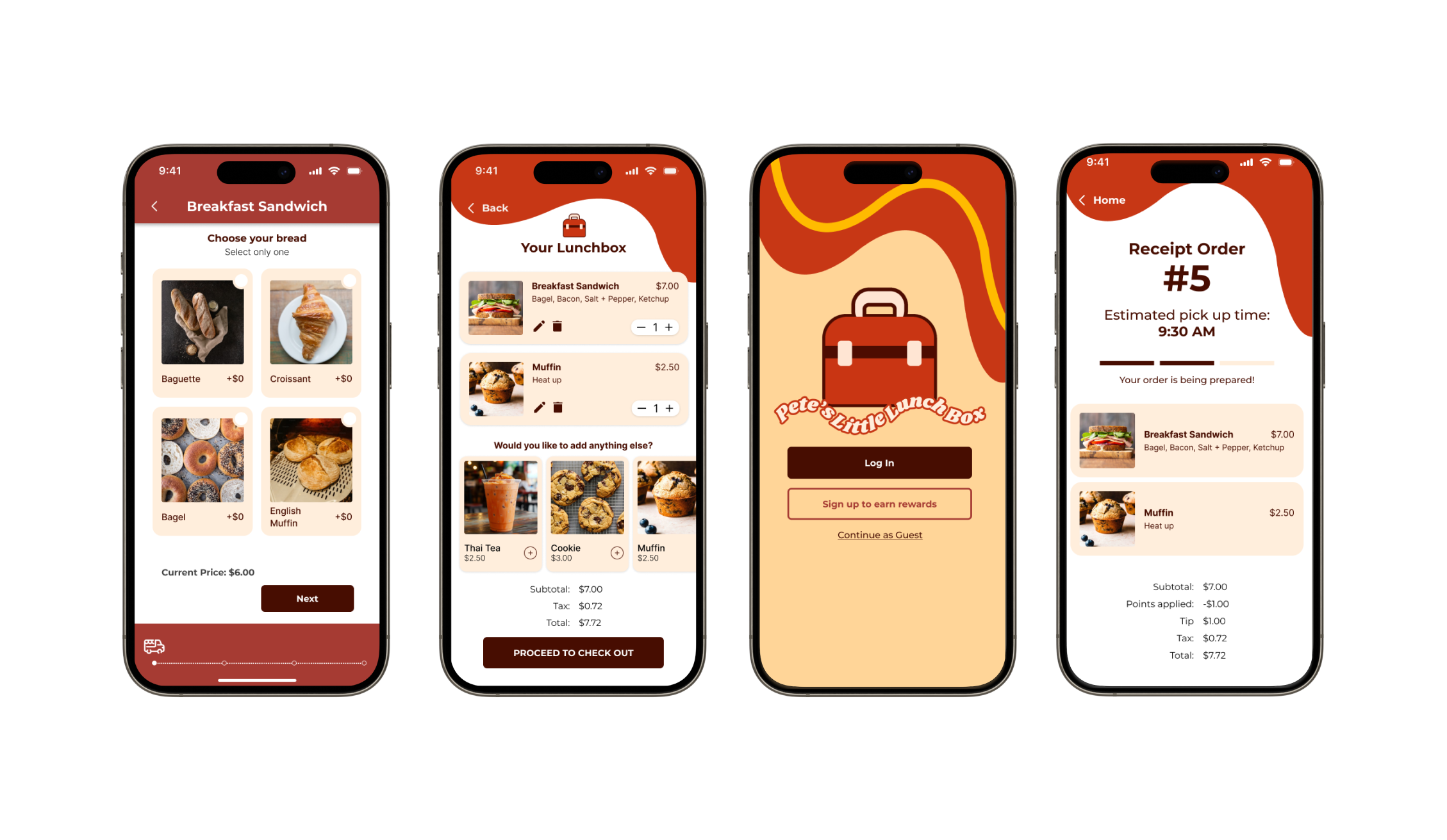
Customization Screen
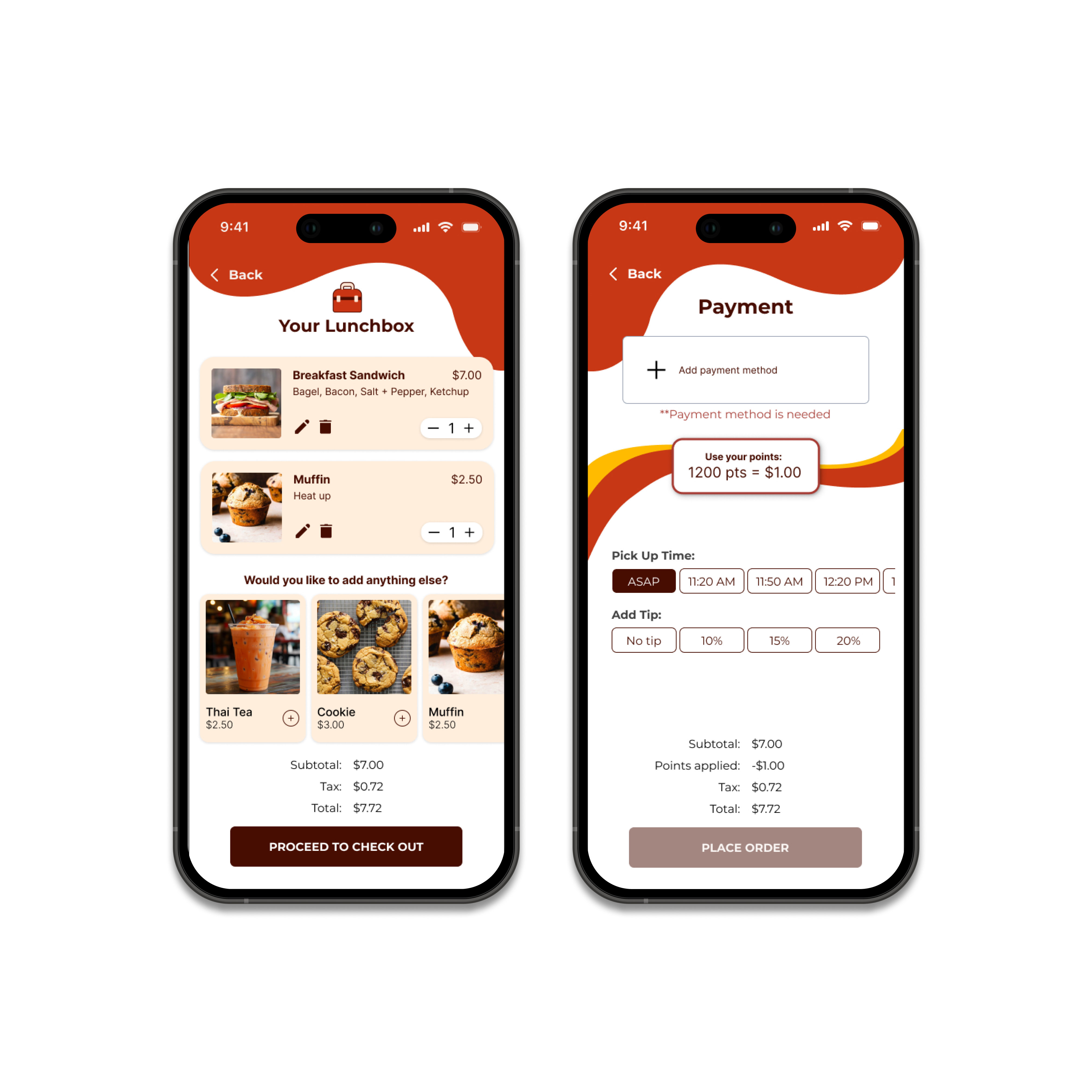
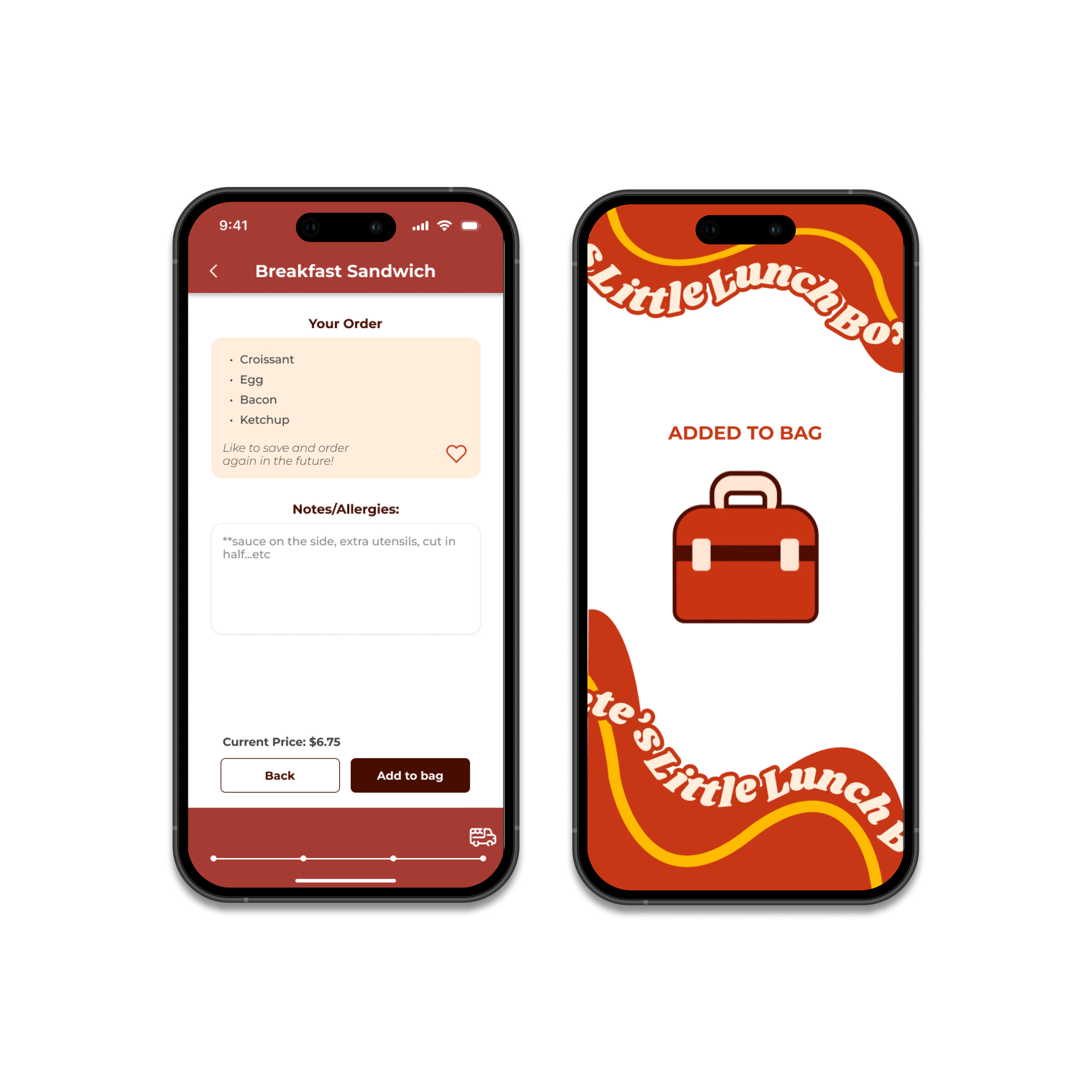
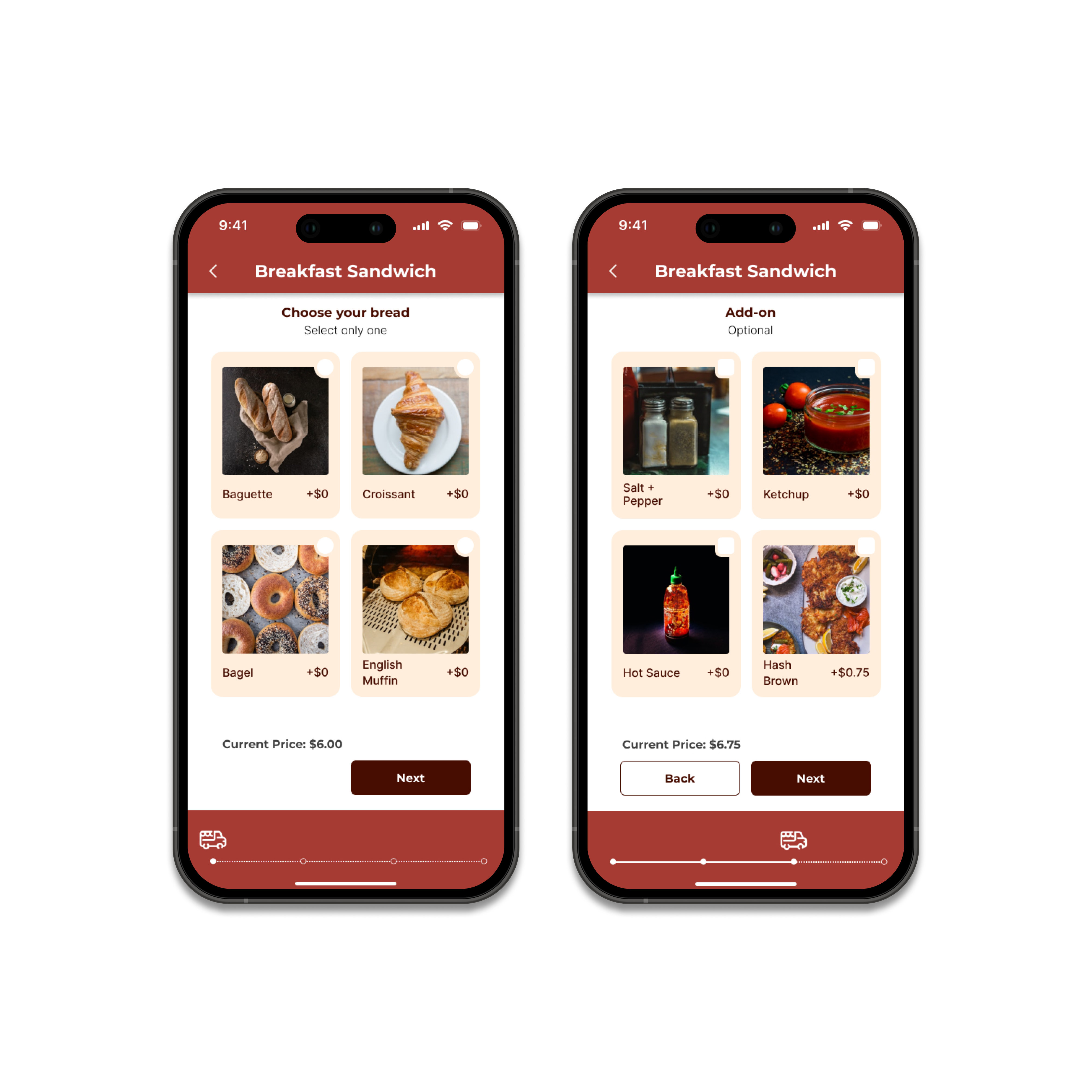
As mentioned above, although Pete's Little Lunch Box has a relatively small menu, it offers extensive customization options for each item. To accommodate this, our team decided to incorporate a customizable system within the app to streamline the menu and provide users with a more intuitive ordering experience.
Reward System
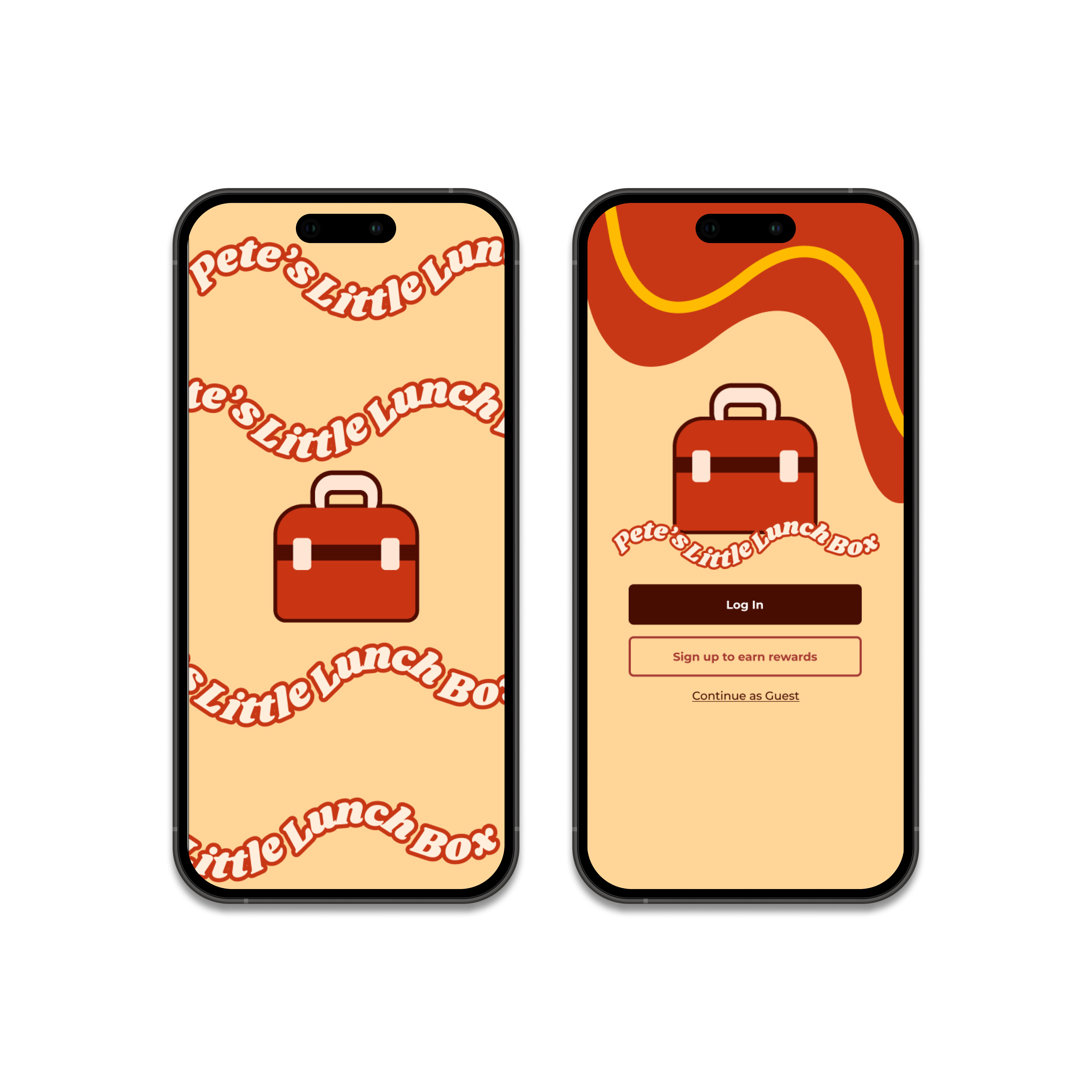
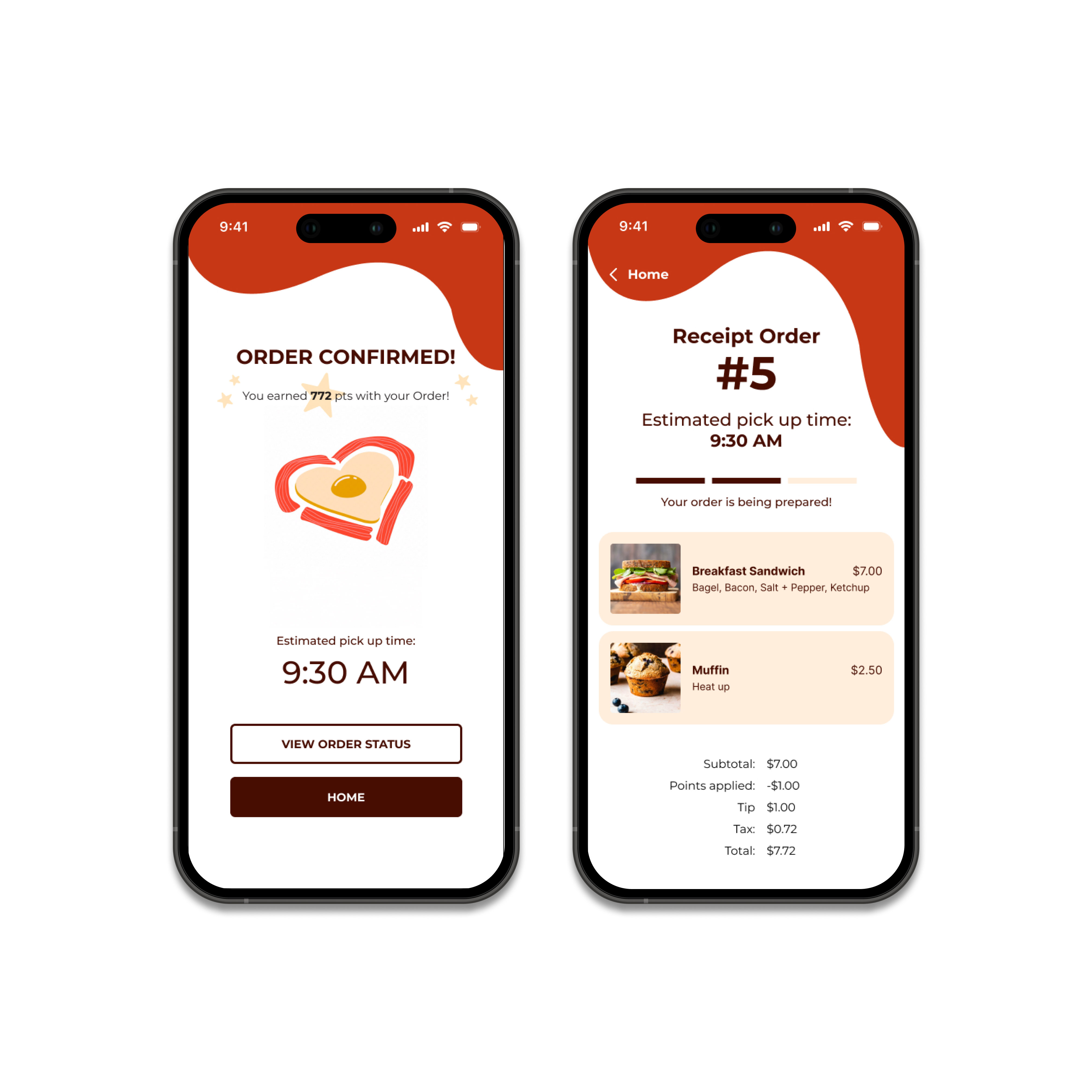
Final Design

Prototype walk through
Takeaways
This project was a formative experience, combining our ideas into functional prototypes. Our redesigned app bridges the gap for Pete's Little Lunch Box by offering a streamlined menu and ordering system, making it more accessible to a larger community. Given more time, we'd enhance the menu and checkout flows for better user exploration and add a settings feature for light/dark mode. We also plan to include an option to contact the food truck for customer concerns.
Collaboration this term was a journey. Despite scheduling challenges due to extracurricular commitments, we effectively communicated via Discord to complete the project. Working through these difficulties allowed us to deliver a great final product.
This project provided an invaluable opportunity to engage in the entire design process from start to finish. Through multiple iterations and rounds of user testing, I learned how to effectively incorporate feedback to continuously improve the design. Group critiques played a crucial role, offering diverse perspectives that refined the app further. What I loved most about this project was the chance to listen to user feedback during each testing phase. Their insights were instrumental in making the design more user-friendly and intuitive.
Ultimately, this project deepened our understanding of UX principles. Using tools like Figma, FigJam, and Figma Slides, we applied key concepts from lectures, such as avoiding overwhelming users with too many navigation options. This focus improved usability, making our app smoother and easier to navigate.
Other Projects